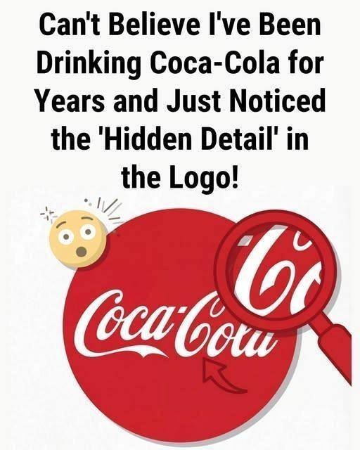
Logos are everywhere. We see them so often that they fade into the background of daily life—on billboards, bottles, vending machines, and TV screens. But every now and then, someone looks a little closer and suddenly says:
“Wait… how did we never notice this before?”
That’s exactly what’s happening again with the Coca-Cola logo, as people online claim to have discovered a “hidden detail” tucked inside one of the most recognizable brand marks in the world.
Some say it’s a word.
Others claim it’s a symbol.
A few insist it’s a secret message hiding in plain sight.
So what are people seeing—and is it intentional, accidental, or just our brains playing tricks on us?
Let’s take a deep dive into the mystery, the myths, and the psychology behind why these logo discoveries keep going viral.
Why the Coca-Cola Logo Gets So Much Attention
Before we get into the “hidden detail,” it helps to understand why the Coca-Cola logo is such fertile ground for speculation.
The logo:
Has existed for over 130 years
Is virtually unchanged since the late 1800s
Is recognized by over 90% of the world’s population
Uses a flowing, cursive script unlike most modern logos
That combination—familiar, old, and ornate—makes it perfect for reinterpretation.
The more decorative a logo is, the more likely people are to see shapes, symbols, or words that weren’t consciously noticed before.
The ‘Hidden Detail’ People Are Talking About
One of the most common viral claims centers on the space between letters, especially in the word Cola.
Some viewers believe they see:
A hidden word
A symbolic shape
Or even a figure embedded in the curves of the lettering
Others claim that when you look at certain parts of the logo—particularly the sweeping tail of the “C” or the spacing between letters—it resembles something meaningful once pointed out.
The moment someone highlights it, people react the same way every time:
“I can’t unsee it now.”
That reaction is a clue that psychology—not secret branding—is doing most of the work.
The Famous Denmark Flag Myth
One of the longest-running “hidden detail” claims about the Coca-Cola logo is that it secretly contains the Danish flag.
The theory goes like this:
Certain curves and negative spaces in the logo resemble the white cross on a red background
Denmark is often ranked as one of the happiest countries in the world
Therefore, Coca-Cola “hid” the Danish flag to associate itself with happiness
It’s a great story.
It’s also not true.
Coca-Cola has officially stated multiple times that:
The logo was created long before modern logo symbolism strategies
The resemblance is coincidental
No flag or national symbol was intentionally embedded
Yet the myth persists—because once someone suggests it, the brain eagerly fills in the gaps.
Why Our Brains Love Finding Hidden Meanings
This phenomenon has a name: pareidolia.
Pareidolia is the psychological tendency to see patterns or meanings where none were intentionally placed. It’s the same reason people see:
Faces in clouds
Shapes in rock formations
Animals in constellations
When applied to logos, pareidolia becomes even stronger because:
Logos are designed to be visually engaging
We already assume brands are clever
We expect hidden marketing tricks
So when someone says, “Did you notice this hidden detail?” your brain switches into detective mode.
Are Hidden Details Ever Intentional in Logos?
Yes—sometimes.
Brands like:
FedEx (the hidden arrow)
Amazon (the smile from A to Z)
Toblerone (the bear in the mountain)
intentionally include subtle visual elements to reinforce brand messaging.
But Coca-Cola is different.
Its logo:
Was designed in 1886
Predates modern branding psychology
Was created by a bookkeeper using Spencerian script
At the time, logos were about elegance and legibility—not hidden symbolism.
That doesn’t stop people from finding meaning later, though.
